Many people have asked about my workflow and what programs I use, so I thought I’d cover the workflow part this week and the programs on another day. The best example I can think of is taking you through a typical day when I was working on my graphic novel, Samurai Elf.
Samurai Elf (vol. 1): Set Apart was completely done in shades of black. Most people think I did it in colour and then turned it to greyscale. I purposefully chose grey because I wanted to use it as though it were a gauche. Digital gauche, if you will. I even experimented further with using pencils instead of inking my pages. I made my pencil work as pristine as possible, then scanned them in, and darkened the line in Photoshop. In retrospect, it wasn’t the best idea, but it was a good try. As I mentioned in my last post, I discovered Manga Studio EX and digitally inked Bull’s Eye (vol. 2). It was a turning point that allowed me to speed up my production time and play with perspective and speed lines. But I’m jumping ahead.
Pencils/Inks
I begin the old fashion way, with a pencil and plenty of paper. I draw all my pages (I’m a stickler for a clean line) and I scan them in. Then I import them into Manga Studio Ex, where I ink over the pencils, make corrections (did I draw 6 fingers on that hand? I need some sleep.) or even additions (that guy’s missing an eyeball!), add speedlines, use rules and French curves, yada yada yada (refer to my last post, “Digital Inking. Why I Like Manga Studio EX”).
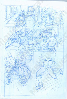
Export High Res
Once the inking is done, I export the file as a .tiff at a high resolution, usually 300-450 pixels. Keeping pixel counts as high as possible comes in handy for printing at various sizes. You never know if you want to republish it in larger format.
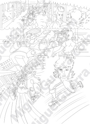
Photoshop
The next step is to bring it into Photoshop and save it as a .psd. I set the ink layer to multiply so that the white background becomes transparent (usually a layer is set to Normal by default. Choose Multiply from the drop down menu). Add a layer beneath the ink layer for your flats. I then choose my colour palette and paint bucket or pencil the colours quickly. I then pass it to Suzy, who begins the tedious work of adding the flats. I don’t do this for illustrations or short stories, but when we work on a book, she does color assists. Suzy makes sure everything is coloured, without any white spaces so that each colours butts up against the next. She also adjusts the palette if she thinks something else would work better. The colours must cover the entire page so that upon printing, there are no nasty white spots appear.
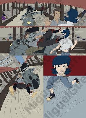
Corel Painter
Once that’s done, I open the .psd file in Corel Painter. I would spend hours rendering the shade and highlights to the pages. I save my file as a .riff so I can continue to work on it. Painter has very natural looking brushes and fantastic paper textures to choose from, allowing me to make Samurai Elf look as close to a painting as possible. Photoshop just doesn’t compare to Painter for looking natural.
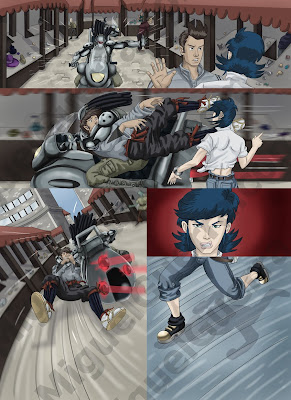
Gutters/Special FX
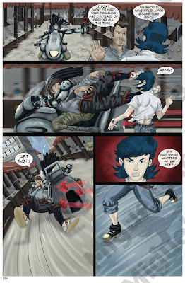
When the painting is all done, I flatten it and save as a .tiff, then open it in Photoshop again. Suzy then cuts out the gutters between panels and resizes it for the final print size. If we need to add special effects, we do that in Photoshop too. In this example, the lights on the hover-cycles are a special effect.
Text
Now it’s time for word bubbles and text. You can do this in Word, but Suzy prefers Illustrator so the text stays a crisp as possible for printing. She adds the bubbles and all of the dialogue, often making edits along the way. So, in the end, we have the final .tiff created in Photoshop and the final text only .ai file created in Illustrator.
If you prefer to just use Photoshop, just add the text as new layers and away you go. Illustrator is a vector based program, so no matter how you resize the text, it stays sharp and in focus (Photoshop is pixel based). Illustrator is also much more malleable for special text effects and wacky bubbles.
Getting Ready for Print
Suzy and I created a template for the final Samurai Elf book in InDesign. You have to include the crop area, bleed area and the type safety area, beyond which you shouldn’t add any text in case it’s cut off by the printer. I then add all of the.tiff image files and .ai text files in the right order, just like it should appear once it’s printed. With the front/back covers, the spine, and all the internal pages. Once everything is set and sized properly, then I export as PDFs and send those off to the printer.
Post by Miguel & Suzy

March 21, 2009 at 11:22 PM
Wow! Great step by step breakdown. Really informative! Makes me feel that I can do a comic book!
October 22, 2011 at 10:31 PM
Nice posting, what I am exactly searched is available in your website. Thanks Bye Printing Workflow